


![Marijuana’s hidden threat to fertility and family planning [PODCAST]](https://kevinmd.com/wp-content/uploads/The-Podcast-by-KevinMD-WideScreen-3000-px-1-scaled.jpg)


How to Create Network Graph Visualizations in Microsoft PowerBI
Microsoft PowerBI is a one of the most popular business intelligence (BI) tools, and while it has all the features you need to create dynamic analytic reporting for stakeholders across the business, creating some advanced data visualizations is more challenging. This article will walk through how to create large network graph visualizations in Microsoft PowerBI […] The post How to Create Network Graph Visualizations in Microsoft PowerBI appeared first on Towards Data Science.
Microsoft PowerBI is a one of the most popular Business Intelligence (BI) tools, and while it has all the features you need to create dynamic analytic reporting for stakeholders across the business, creating some advanced data visualizations is more challenging.
This article will walk through how to create large network graph visualizations in Microsoft PowerBI to enable dynamic and interactive exploration of interconnected datasets such as supply chain networks, financial transactions, and much more.
But before we do that, let’s take a look at some quick foundations of network graphs.
Network Graph Foundations
Data for network graphs, referred to as “graph data” is data formatted in node and edge format. Nodes represent discrete things and edges represent the relationships between nodes.

Let’s take a simple example of an online social network, which can be represented in graph format.
Nodes refer to profiles, while edges refer to following status.
A simple network of 3 profiles might end up looking like this:

When visualizing network graphs, we can embed additional information about nodes and edges in various ways, such as but not limited to:
- Node size
- Edge size
- Node color
- Edge color
- Labels
Structuring Network Data
So now that you know the basic building blocks of a network graph, how do you structure and transform your dataset?
Graph Data is Everywhere
While you might be thinking, “we only have relational data where I’m at”, that’s often not the case. In fact, lots of relational datasets can be visualized as a network graph.
Let’s take a simple sales table as an example with columns for product name, customer name, and quantity.

We can represent this same sales table as a network graph by representing both product name as the node type “product”, customer name as the node type “customer”, and each row as the edge “Purchased”.
Visualized as a network graph, this might look something like:

Graph Data Formats
There are a few ways this data is structured, such as but not limited to:
- Node & Edge Lists (Often in .csv format)
- Graph Databases (Such as Neo4j)
- Graph Files (such as GraphML or GEXF)
But in this article, we will be using a combined node and edge list into a single tabular dataset due to the requirements of making network graphs within Microsoft PowerBI.
Mapping Your Data
You’ll need to map your data to the following tabular format with each record representing an edge:
- Source Node (Required) -> This is a unique identifier of the starting node of the edge (for example, Customer ID)
- Target Node (Required) -> This is a unique identifier of the ending node of the edge (for example, Product ID)
- Source Color -> This is a category identifier for the source node (for example, Customer Type)
- Target Color -> This is a category identifier for the target node (for example, Product Category)
- Link Color -> This is a category identifier for the edge (for example, Sales Channel)

Creating the Network Graph Visualization
Now that we have our data mapped, we can create the network graph visualization.
While Microsoft doesn’t include a network visual in the default PowerBI visuals, we can access the visual marketplace to download third-party visuals.

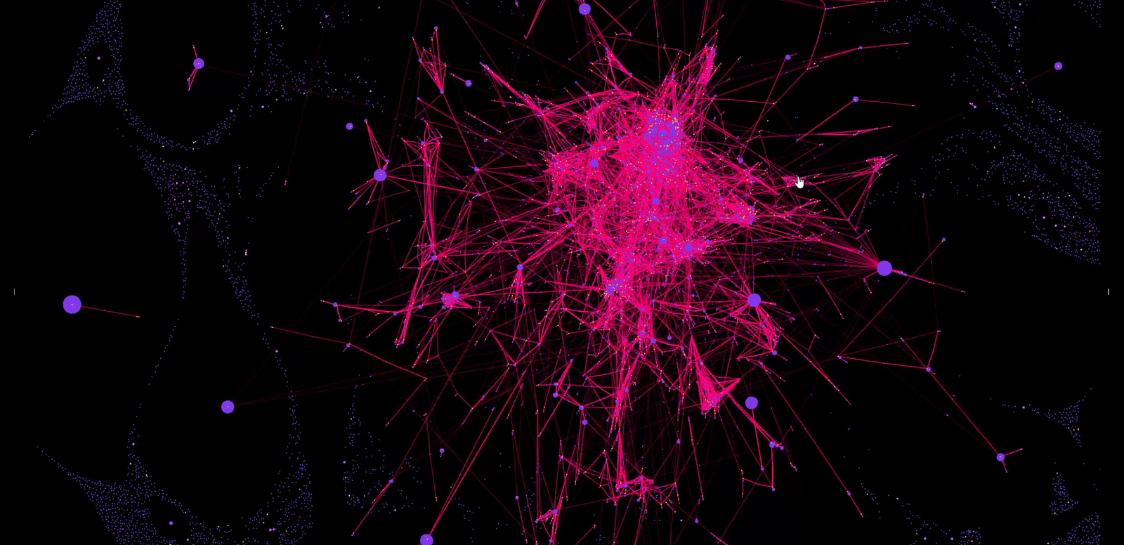
For this article, we will be using the visual “Astra”, which lets you create large-scale network graphs with plenty of customization options.

Once you have it installed, it will be in your visual library.

Drag the visual onto your canvas, select it, and note the values required (which we mapped earlier). The visual also has options to pass x and y coordinates as well as custom labels, however we won’t use those options in this article.

The only required values are “Source Node” and “Target Node” so let’s start there. Drag the columns you mapped to those nodes from the data pane.

You’ll notice the visual graphs our nodes and edges, however, it isn’t looking so great. We’ll need to change some of the simulation settings.

To change the simulation settings, open the formatting pane, then simulation, and increase both the link distance and repulsion force. I chose to set repulsion to 0.3, and link distance to 15.

You can now see that we get a much better layout of our data.

Let’s now encode some additional information into the graph, by changing the node color based on node categories. Drag the fields you mapped above to Source Color and Target Color.

You’ll now notice the nodes are colored differently and we have a legend on the visual.

Let’s do some formatting to the background color and node colors in the formatting pane.

Congratulations! You’ve created a network graph visualization in PowerBI with dynamic node coloring.
We add even more information to the graph, for example:
- Turn on node weight to make nodes with more edges larger in size
- Adding a link category to the color the links
- Adding different labels to the nodes
But we aren’t done there.
Once we have the visualization, stakeholders have to use it to make more informed decisions.
Interacting with the Network Graph
There is immediate value in a static network graph, such as being able to visually see how data is interconnected through relationships.
However, there are some additional features we can use to make the visualization more insightful.
First, we can interact with the legend by selecting categories to highlight them on the graph. For example, quickly locating Widgets in the graph:

We can also select individual nodes in the graph by clicking on them.
Alternatively, you can toggle “select adjacent nodes” in the node properties to have it select not just the node clicked on, but all nodes directly connected to it through an edge.
For example, selecting “Widget A” with “select adjacent nodes” on shows all customers who have purchased that widget:

But selecting nodes doesn’t just highlight them in the visualization, it passes that filter to the rest of your PowerBI report.
This means we can add additional charts to give some more context to the user’s selections.
For example, adding a bar chart for quantity purchased by customer:

We can also do the reverse by filtering the data going into the network visual. This can be accomplished in multiple ways, such as:
- Slicers
- Selecting pieces of other charts, such as a slice of a donut chart
- Filter pane
Let’s use a slicer to slice the graph on Customer Type:

Building Complex BI Reports
While the example network graph in this article is relatively simple for demonstration purposes, you can build quite complex BI reporting for stakeholders.
The Astra PowerBI visual used in this article can scale to hundreds of thousands of edges, and paired with additional cross-filtered visuals & slicers can enable more advanced analytics than is possible with default PowerBI reports.

Conclusion
Network graphs are all around us, even hiding in your relational datasets. While there is great network graphing tooling out there, building network graphs in PowerBI allows you to bring this advanced analytic tool to your standard BI stakeholders, as well as build advanced reporting by adding context with additional filters and charts.
The post How to Create Network Graph Visualizations in Microsoft PowerBI appeared first on Towards Data Science.