


Is it me, or is the Nintendo Switch 2 box art really ugly?
Destructoid, I have something I need to get off my chest that feels petty the more I think about it, but has become a bigger concern as a physical video game collector. Why on earth of the Switch 2 boxes, and box art, so darn ugly? I adore collecting physical media and having a shelf of content to pick out during my time off. I enjoy looking at my collection of games, books, and the aesthetic it gives off. But the Nintendo Switch 2 boxes aren't cutting it for me. For those who haven't seen the Switch 2 box art yet, they are red with a thick label at the top of the box with the Switch 2 logo dead center, with the game's box art underneath it with all the usual bells and whistles you'd expect to see. I get it. Nintendo had to do something to make the box art different from the Switch 1 so consumers didn't pick up a Nintendo Switch 2 box and think it would work on the older system, but the more I look into the box art for day one and year one games, the less appealing I've been finding it. https://twitter.com/SerebiiNet/status/1927713625642332379 This feeling was heightened by the recent reveal of the Pokémon Legends Z-A Switch and Switch 2 Edition boxes. The Switch box art is minimal and gorgeous, letting the art pop out with a small Switch 1 logo. The Switch 2 version, though, feels condensed, and don't even get me started on the massive text box at the bottom of the Switch 2 edition games that feel like an eyesore. I think for these versions, I would rather buy the Nintendo Switch version and pay for the upgrade fee digitally so that I have a piece of physical media that I care about. But I can't help but wonder if it's just a me thing, or if others share the same views. Let me know in the comments below what you think. The post Is it me, or is the Nintendo Switch 2 box art really ugly? appeared first on Destructoid.

Destructoid, I have something I need to get off my chest that feels petty the more I think about it, but has become a bigger concern as a physical video game collector. Why on earth of the Switch 2 boxes, and box art, so darn ugly?
I adore collecting physical media and having a shelf of content to pick out during my time off. I enjoy looking at my collection of games, books, and the aesthetic it gives off. But the Nintendo Switch 2 boxes aren't cutting it for me.
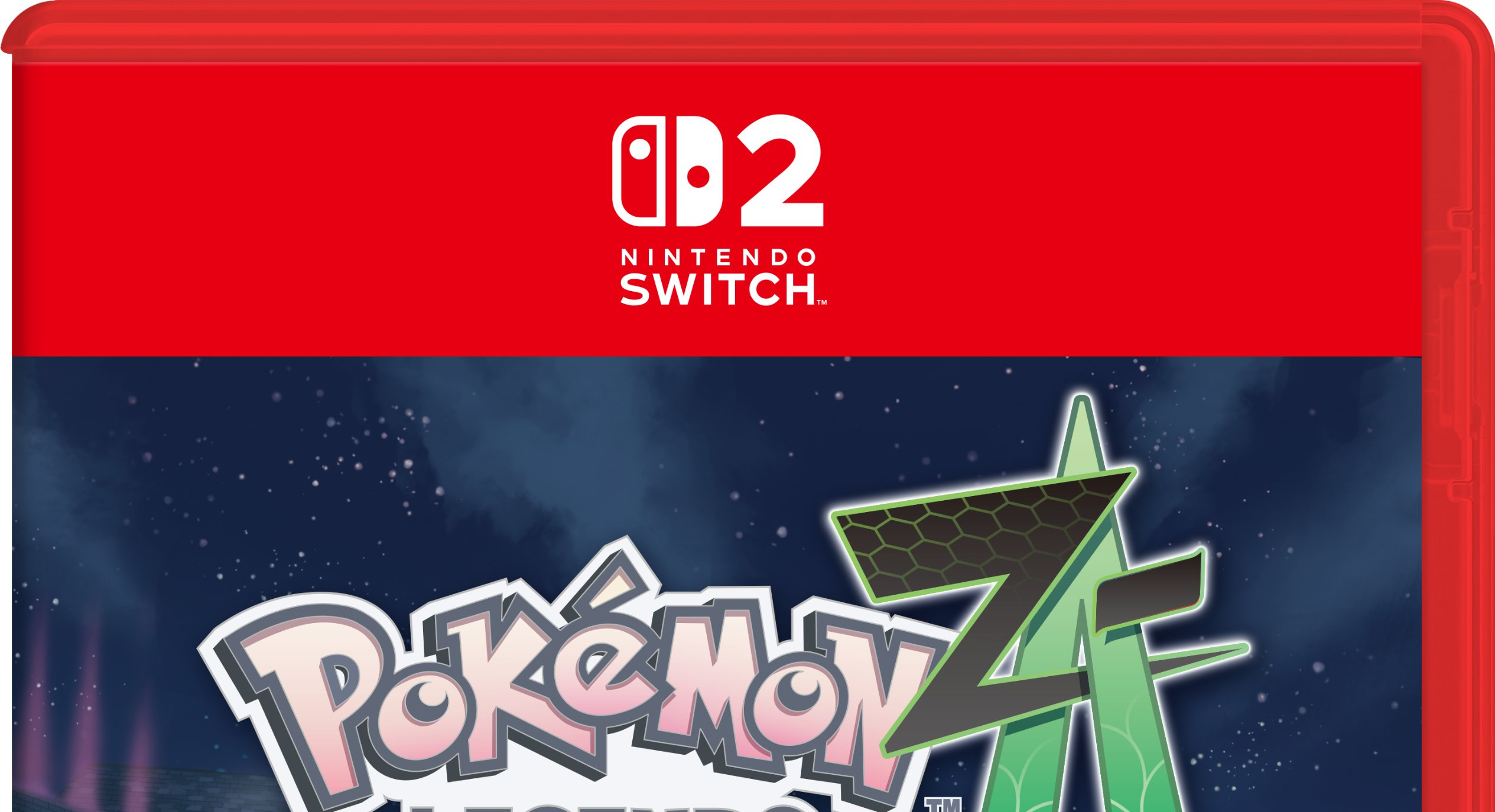
For those who haven't seen the Switch 2 box art yet, they are red with a thick label at the top of the box with the Switch 2 logo dead center, with the game's box art underneath it with all the usual bells and whistles you'd expect to see.
I get it. Nintendo had to do something to make the box art different from the Switch 1 so consumers didn't pick up a Nintendo Switch 2 box and think it would work on the older system, but the more I look into the box art for day one and year one games, the less appealing I've been finding it.
This feeling was heightened by the recent reveal of the Pokémon Legends Z-A Switch and Switch 2 Edition boxes. The Switch box art is minimal and gorgeous, letting the art pop out with a small Switch 1 logo. The Switch 2 version, though, feels condensed, and don't even get me started on the massive text box at the bottom of the Switch 2 edition games that feel like an eyesore.
I think for these versions, I would rather buy the Nintendo Switch version and pay for the upgrade fee digitally so that I have a piece of physical media that I care about. But I can't help but wonder if it's just a me thing, or if others share the same views.
Let me know in the comments below what you think.
The post Is it me, or is the Nintendo Switch 2 box art really ugly? appeared first on Destructoid.
![Anime Rangers X Tier List [UPDATE 1] – All Legendary, Mythic, Secret, and Ranger Units Ranked](https://www.destructoid.com/wp-content/uploads/2025/04/ultimate-anime-rangers-units-tier-list.webp?quality=75)