


Inside the LCP identity: The art and ambition behind “What We’re Made Of”
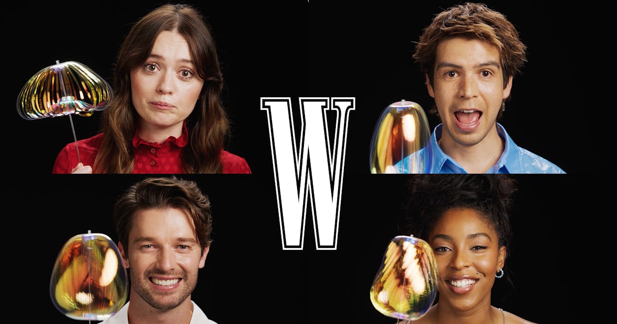
Image via Riot Games 2024 was a year of transformation for League of Legends’ competitive landscape as Riot Games overhauled some of its major leagues. But while fans are questioning some of the changes, others seem to have hit the mark. Among them is the League of Legends Championship Pacific, which emerged as an ambitious … Continued The post Inside the LCP identity: The art and ambition behind “What We’re Made Of” appeared first on Esports Insider.
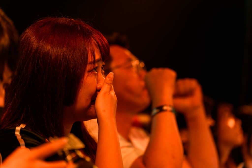
2024 was a year of transformation for League of Legends’ competitive landscape as Riot Games overhauled some of its major leagues. But while fans are questioning some of the changes, others seem to have hit the mark.
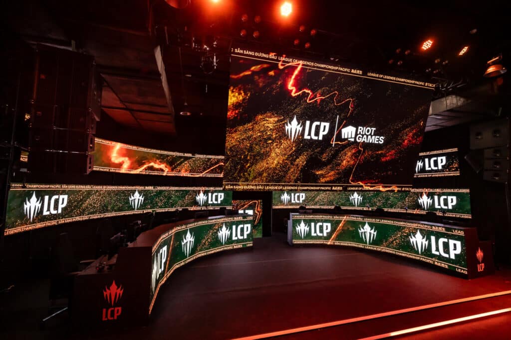
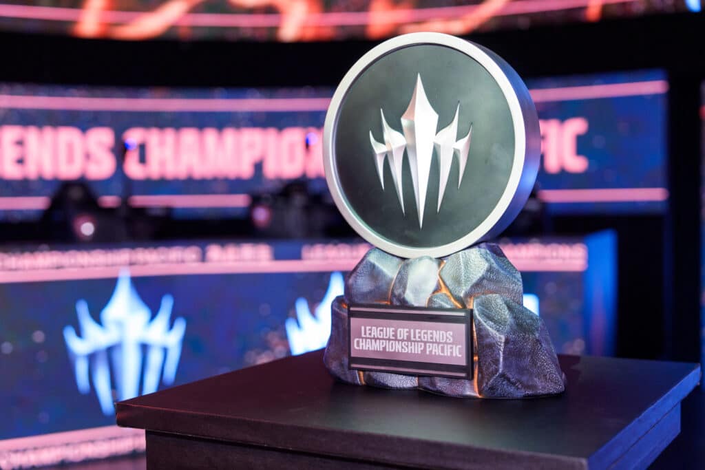
Among them is the League of Legends Championship Pacific, which emerged as an ambitious reimagining of the region’s competitive brand. Through the unification of multiple Pacific leagues, Riot introduced a new Tier 1 region with an identity meant to reflect a broader, more connected vision of competitive League across a diverse and culturally rich region.
However, many fans have continued to voice their disappointment over seeing their favourite domestic leagues relegated to Tier 2 status to make room for the LCP, worried that local rivalries and regional pride were sacrificed in the process. So, speaking to players and fans from vastly different backgrounds without losing what defined the region’s competitive spirit became the primary challenge of the newly-formed LCP.
To overcome that, Riot tapped into global brand studio Koto, whose Sydney office led the effort. What came to be is a vibrant, emotionally charged identity anchored into the motto ‘What We’re Made Of.’
In an interview with Esports Insider, Koto’s Executive Creative Director, Melissa Baillache, shared insight into how one of LoL Esports’ major regions’ complex identity took shape.

She shared how the LCP identity became a story not just of visuals, but of values and emotional truths that connect a region of millions of players. From focusing on encapsulating the internal fire and collective pride that define many cultures in the Pacific, to balancing between innovation and tradition, here’s how the LCP came to be.
How to Choose the Right Sentiment for a League’s New Identity
When setting out to reimagine the identity of a league with such regional complexity, the emotional tone was Koto’s first priority. The creative team needed a guiding idea that would resonate not just with players, but with fans scattered across multiple countries, each with their own values, languages and esports history.
The final brand line, ‘What We’re Made Of,’ reflects this intent, according to Baillache. And while some fans might find the phrase a bit vague, others appreciated its open-ended and inclusive nature.
Baillache simply described it as ‘human,’ a new motto with the ability to carry pride, struggle and determination without locking itself into a single narrative. “It felt really real,” she said, pointing to the importance of emotional authenticity over pure hype. “We just kept coming back to it. [The sentence] had this real resonance. It felt really real, and it felt like it could grow over time.”
According to Baillache, the new motto leaves room for personal interpretation, whether that’s a fan’s pride in their home team or a player’s resilience after a tough loss—sentiments all League fans can relate to.
Embracing Cultural Diversity Under One League
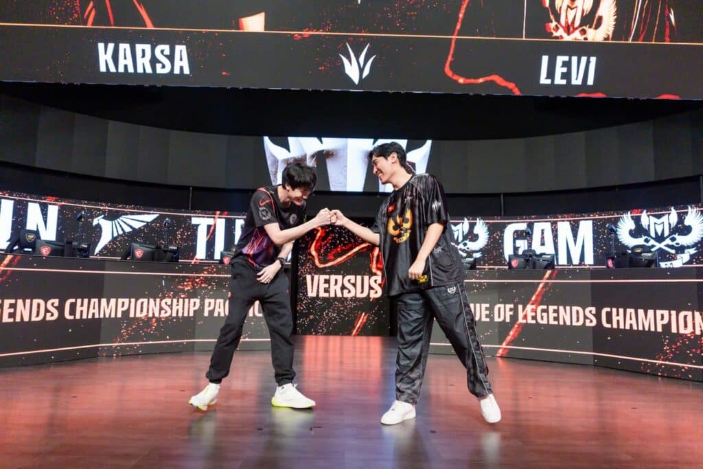
The newly rebranded league now spans more than 10 countries across the Asia-Pacific region, including Japan, Taiwan, Vietnam and Australia. Bringing those regions under one brand marks a significant and challenging departure from what fans were used to, where competitive play was more fragmented, with each area having its own league, its own rhythms and often, its own fan base identity. This raised complex questions about cultural representation and ownership of the brand for all fans.
According to Baillache, it all started with recognising that the APAC region is ‘wildly different’ culturally and how. This involved extensive qualitative research, including direct conversations with Riot spokespeople, teams, players and fans across the region. She highlighted the importance of picking apart a consistent ‘thread’ that ran through these diverse perspectives, ultimately identifying a shared ‘fire in the belly,’ a collective passion to showcase the region’s competitive spirit and prove its strength on the global stage.
For Baillache, working closely with Riot’s regional offices was key to understanding the esports fans. By connecting Koto with its regional teams in places like Singapore, Japan and Vietnam, it gave Baillache’s team direct access to fans and players, which led the studio to understand the important ‘truths’ of the region right from the community.
This collaborative and ‘deeply consultative’ process allowed Koto to navigate the complexities of cultural translation and resonance. Baillache specifically mentioned the challenge of ensuring that English messaging was not only translatable but also held the ‘same intent’ across languages like Japanese and Vietnamese, even if the exact wordings differed.
This meticulous attention to cultural nuance, facilitated by Riot’s regional connections, was instrumental in developing an identity that felt authentic and truly ‘shared’ by the diverse communities it sought to represent, fostering a sense of belonging and ‘pride’ rather than an imposed corporate identity.
“I will be honest, it’s never easy when you’re doing something with such a huge fan base,” continued Baillache. “And I would almost liken it to a little bit like branding a place because if you get that wrong it’s not going to be authentic. People are going to find you out and they’re not going to like it and they’re going to let you know that they don’t like it because it doesn’t represent them.”
The Power and Peril of Rebranding
Baillache and her team didn’t want the new identity to feel like a monolithic export imposed from ‘corporate level’ people. To avoid this common mistake and create something truly resonant, she stressed the importance of rigorous ‘due diligence’ and talking to the ‘real people’ to understand their perspectives and find a consistent thread that runs through their diverse experiences.
Changing and rebranding a long-standing competitive structure is inherently risky, especially in sports where fan loyalty runs deep and changes can trigger strong reactions. According to Baillache, key factor in forging a new identity was not to chase novelty for its own sake. Instead, the goal was to find the soul of the league and express it in a way that would feel both new and familiar—and yet there will be people who will not like it.
“You can’t make everyone happy. There’s no way,” Baillache admitted, understanding that there will always be people who don’t like ‘what you do.’ Fans may hold tightly to the symbols and names they grew up with, and no amount of strategic branding can fully offset the nostalgia factor. In esports, even fonts can spark a contentious online discussion..
Word Choice, Identity and Voice
Language in branding is rarely incidental—and for the LCP, words were as crucial as the color or shape of the new logo. From taglines to tone, Baillache explained that every phrase had to walk a fine line between being aspirational and grounded. ‘Too corporate’ and it would feel inauthentic. Too niche, and it might alienate parts of the region’s diverse audience.
One of Koto’s biggest goals was to craft a voice that felt both elevated and accessible. The final copy, as Baillache describes it, had a ‘relatable sharpness’ driven by pride, but not ego. Sentences were kept punchy, often action-oriented, so that the brand could speak not just to fans, but to new players who dream of going pro.
Every word was tested for emotional temperature. “We looked for language that felt earned,” she pointed out, stressing how important it was to sound like the voice of the community—not of a brand trying to talk down to it. That subtle confidence is baked into everything from social posts to brand videos, where even silence and pauses are used strategically.
On a more technical level, a mix of sharp, straight shapes with ‘sharper, more expressive’ lines were used to forge LCP’s identity—a design choice meant to hint at old Southeast Asian art, but without just copying it. For most, this gave the LCP brand a fresh, modern look that still respected local traditions. As Melissa put it, the league’s identity needed to be ‘something that felt shared, not borrowed.’
“We wanted to make sure that we could deliver something that couldn’t be ignored, that the fans would love and get behind, that the players would get behind that could inspire new players and also obviously the pros would be proud to be a part of,” Baillanche concluded.
The new LCP identity is still in its early chapters. Whether it ultimately endures in fans’ hearts is a question only time will answer. But in the eyes of its creators, the rebrand was never about forgetting the past, but about redefining what it means to belong to something bigger.
The post Inside the LCP identity: The art and ambition behind “What We’re Made Of” appeared first on Esports Insider.