


Korean Air Unveils New Livery & Branding: Modern, Blue, And Boring?
Recently, Korean Air’s takeover of Asiana was finalized, after a process that spanned over four years, due to delayed regulatory approval. The airline has today officially unveiled an updated livery and branding. This was first leaked a couple of days ago, but is now official, so let’s cover all the details.

Recently, Korean Air’s takeover of Asiana was finalized, after a process that spanned over four years, due to delayed regulatory approval. The airline has today officially unveiled an updated livery and branding. This was first leaked a couple of days ago, but is now official, so let’s cover all the details.
Korean Air’s new and very blue livery & branding
Korean Air has today revealed its first full brand redesign since 1984, which includes a new livery, new logo, and more. This will be introduced across the combined airline over the coming years, though like any rebranding, it’ll take some time. For that matter, Asiana is expected to be run as a separate brand for the next couple of years, until the new branding is more widespread.
The most significant change is a new livery. This has already been painted on a less than one-year-old Boeing 787-10 with the registration code HL8515. On February 23, 2025, the plane flew from Incheon (ICN) to Busan (PUS), and then on March 9, 2025, it returned to Incheon, after getting a fresh coat of paint. For context, below is what Korean Air’s previous livery looked like.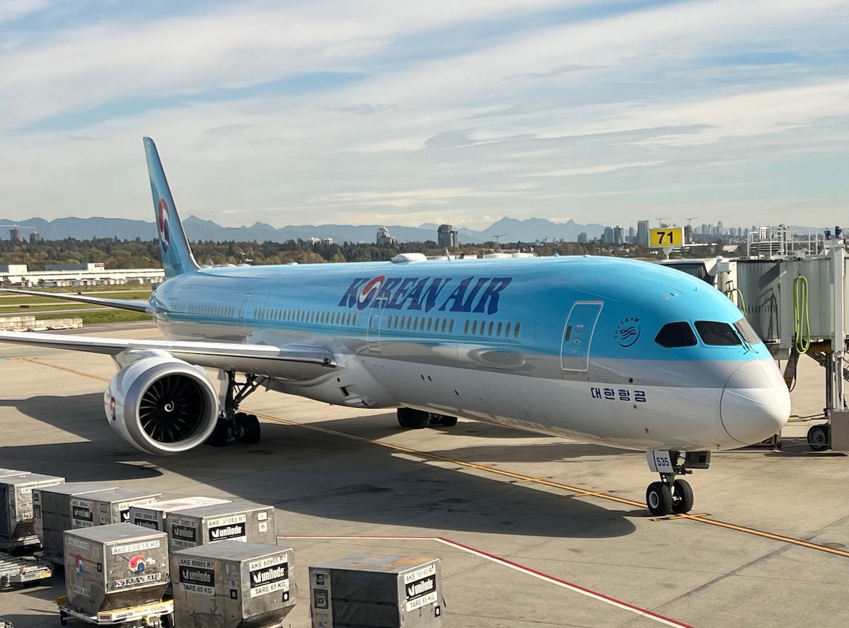
Meanwhile below is what Korean Air’s new livery looks like. 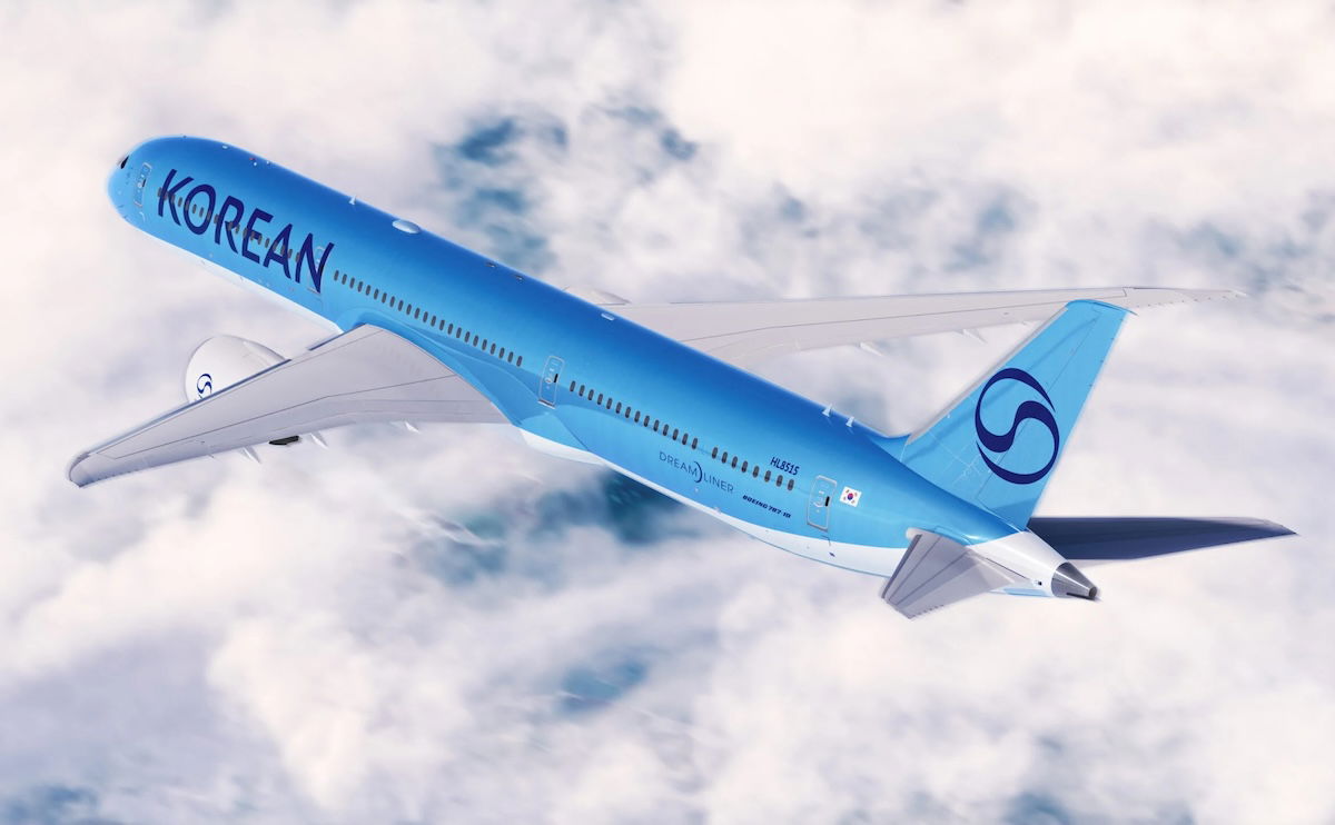
As the company describes it, “the updated logo aligns with modern and global minimalist branding trends while preserving the airline’s distinct identity.” As you can see:
- The side of the aircraft says “KOREAN” rather than “KOREAN AIR,” and in much larger, simplified, and modern font
- The livery is now just various shades of blue, with no red being used anymore
- The straight line separating the blue from the white has been replaced by a curved line
- Korean Air’s logo continues to be a stylized taeguk, a traditional Korean symbol for the harmony between opposing forces used on the country’s flag; however, rather than being in red and blue as before, it’s now just in blue
My take on Korean Air’s new livery
Let me acknowledge a few things, to start:
- Airplane liveries don’t really sell tickets, though branding overall does matter, or at least companies spend a lot of money on branding
- Us aviation geeks definitely care about this stuff a lot more than the average traveler
- Often my impression of liveries evolves over time, both as I become accustomed to them, and as I see them in person
All that being said, my initial impression is that the new livery really feels like the lowest common denominator in livery design. It’s almost as if Korean Air asked AI to create a modern livery that’s an evolution of the old Korean Air branding, without doing anything too interesting.
Yes, the new livery looks quite modern, and I do prefer the new shade of blue compared to the old shade of blue. But it also seems so unoriginal, and like it’s such a copy of the direction that so many airlines have been headed with their liveries.
I feel like Korean Air planes used to stand out due to their liveries, while the new one feels forgettable.
Bottom line
Following its takeover of Asiana, Korean Air is undergoing a rebranding, including the introduction of a new livery and logo. The new design is definitely a lot more modern, though also quite boring and forgettable, in my opinion. I can’t say I’m a huge fan, but who knows, maybe it’ll grow on me over time.
What do you make of Korean Air’s new livery and branding?